Picture this: you open a financial website to check interest rates or explore an investment option. The page takes forever to load, the layout looks like it’s from 2008, and you can’t even find the login button without squinting. Do you stay? Probably not.
That’s the power of design in finance. Unlike fashion or food sites, where style might win people over, financial sites are judged almost instantly on trust and clarity. If it feels even slightly off, visitors leave. In this piece, we’ll talk about the must-have features of financial website design, mistakes that ruin credibility, and how Qosprey—a digital solutions company with a global footprint—helps businesses get it right.
Why Design Matters So Much Here
Money is emotional. People don’t part with it easily. A confusing, clunky site makes them feel unsafe. A clear, professional one does the opposite.
Think about walking into a bank. The walls are clean, the counters are organized, and staff greet you. You feel reassured. A website works the same way.
Good design does three simple but powerful things:
- Creates a sense of trust within seconds.
- Makes finding services effortless.
- Encourages action—like opening an account or contacting support.
Bad design, on the other hand, feels like a locked door.
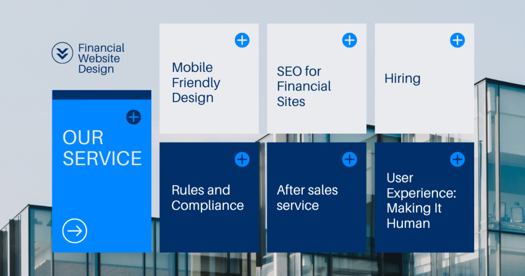
What Every Financial Website Needs
Visible Security
The little lock icon in the browser bar? That’s not decoration. It signals encrypted connections. Add in clear privacy policies, recognizable trust badges, and two-factor authentication, and you instantly look more reliable.
Easy Navigation
Finance is already filled with jargon. Don’t make the website another maze. Menus should be simple. Calls-to-action should stand out. Important pages—like login or contact—should never be buried.
Mobile-Friendly Design
Most people check accounts or apply for services from their phones. If the site breaks on mobile, you lose them.
Speed
Three seconds. That’s how long most people wait before abandoning a page. A fast site isn’t just nice—it’s survival.
User Experience: Making It Human
A great financial website feels less like reading a policy document and more like talking to a helpful advisor.
That means:
- Short, clear explanations instead of endless jargon.
- Account dashboards that make sense without a manual.
- Accessibility features for users with vision or mobility issues.
- Tools that add value—like a loan calculator or savings tracker.
The opposite? Complicated sign-up forms, walls of tiny text, and hidden contact info. Those are deal breakers.
Rules and Compliance (No Skipping This Part)
Unlike lifestyle brands, financial sites can’t play fast and loose. GDPR, PCI DSS, local data protection rules—these aren’t optional. Customers need proof that you’re following the rules.
This is where Qosprey comes in. Their team builds compliance into every project. That means encryption, safe payment gateways, and clear policies—all without making the design clunky.
Being Seen: SEO for Financial Sites
Even a brilliant site fails if nobody finds it. SEO helps financial services show up where people search.
A few essentials:
- Use clear keywords in titles and headings.
- Write meta descriptions that explain, not exaggerate.
- Create content—blogs, guides, case studies—that answer real customer questions.
- Don’t ignore local search if you’re a regional bank or firm.
It’s less about stuffing keywords and more about sounding useful.
Qosprey’s Way of Doing Things
Founded in 2023, Qosprey has grown quickly. With a 15-member team rooted in Bangladesh but serving clients worldwide, they’ve built everything from personal portfolios to full financial platforms.
What makes them different is their focus:
- Security and compliance first.
- Designs that load fast and look modern.
- Pricing that startups can actually afford.
- An upcoming SaaS platform aimed at helping small businesses simplify daily operations.
Their motto says it well: “Make business our headache, not yours.”

Mistakes That Sink Trust
- Overloading pages with financial buzzwords.
- Forgetting mobile users exist.
- Skipping SSL or ignoring updates.
- Designing only for looks, not for usability.
What’s Next in Financial Website Design
The industry isn’t standing still. Expect more:
- Chatbots that actually answer real questions, not just give generic replies.
- Voice search (“What’s my balance?” or “Nearest branch?”).
- Personalized dashboards that predict needs.
- SaaS tools like those Qosprey is preparing to roll out.
Conclusion
Financial website design is about more than colors and layouts. It’s about showing customers that their money—and their trust—is safe with you.
If you want a partner who understands both design and finance, Qosprey is worth talking to. Their mix of global experience, fair pricing, and commitment to client success makes them a smart choice for financial businesses looking to grow.
👉 Want a site that customers trust from the first click? Qosprey can make it happen.
FAQs
A financial website must build trust. Good design ensures security, easy navigation, and a smooth experience that encourages users to stay and engage.
Key features include SSL security, mobile-friendly design, fast load times, simple navigation, and clear calls to action.
SEO makes financial websites more visible on search engines. It attracts new clients by ranking for terms like “secure online banking” or “fintech platform design.”
Common mistakes are using too much jargon, skipping mobile optimization, weak security, and focusing on looks instead of usability.